The Home Depot Corporate Website
Overview
Our team was tasked to recreate the corporate web experience for The Home Depot. This project was very exciting as I lead a two day stakeholder workshop early on in the process to decipher what was the true outcome for the site. After one month of insights and planning I began wireframes for the core site experience while crafting the UI experience. This was a great agile approach that worked for us in having development work so early on in the process. Please take a look for yourself here!
My Role
Customer Insights & Ideation
I lead a 2 day stakeholder workshop to uncover the true breadth of the project before kickoff. I held customer and stakeholder interviews for qualitative and quantitive research.
Experience Strategy & Vision
After my research, I created red routes for all project features for both customer and business goals. I prioritized and negotiated features for launch and beyond.
Planning & Scope Definition
Working with my managing partners we defined the project scope for the initial launch as well as future phases enhancing the user experience.
OVERSIGHT & COORDINATION
I had oversight over all designs through creation and implementation working with Designers and Developers ensuring that the users best interest was always kept first and foremost.
Design Execution & Validation
I created presentation decks for all deliverables of work throughout the project lifecycle. Pitched our final product at THD headquarters to the executive level stakeholders.
Leadership
I was not only in charge of all UX research, but also executed visual design, user journeys, wireframes, prototypes, design specs, and user testing.
Insights
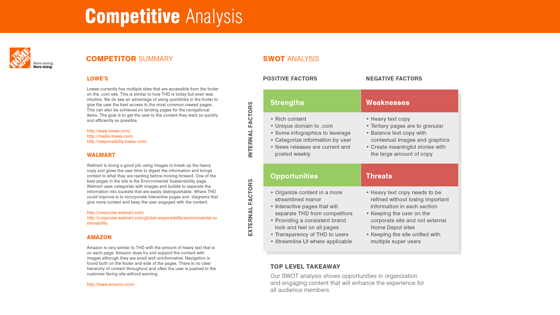
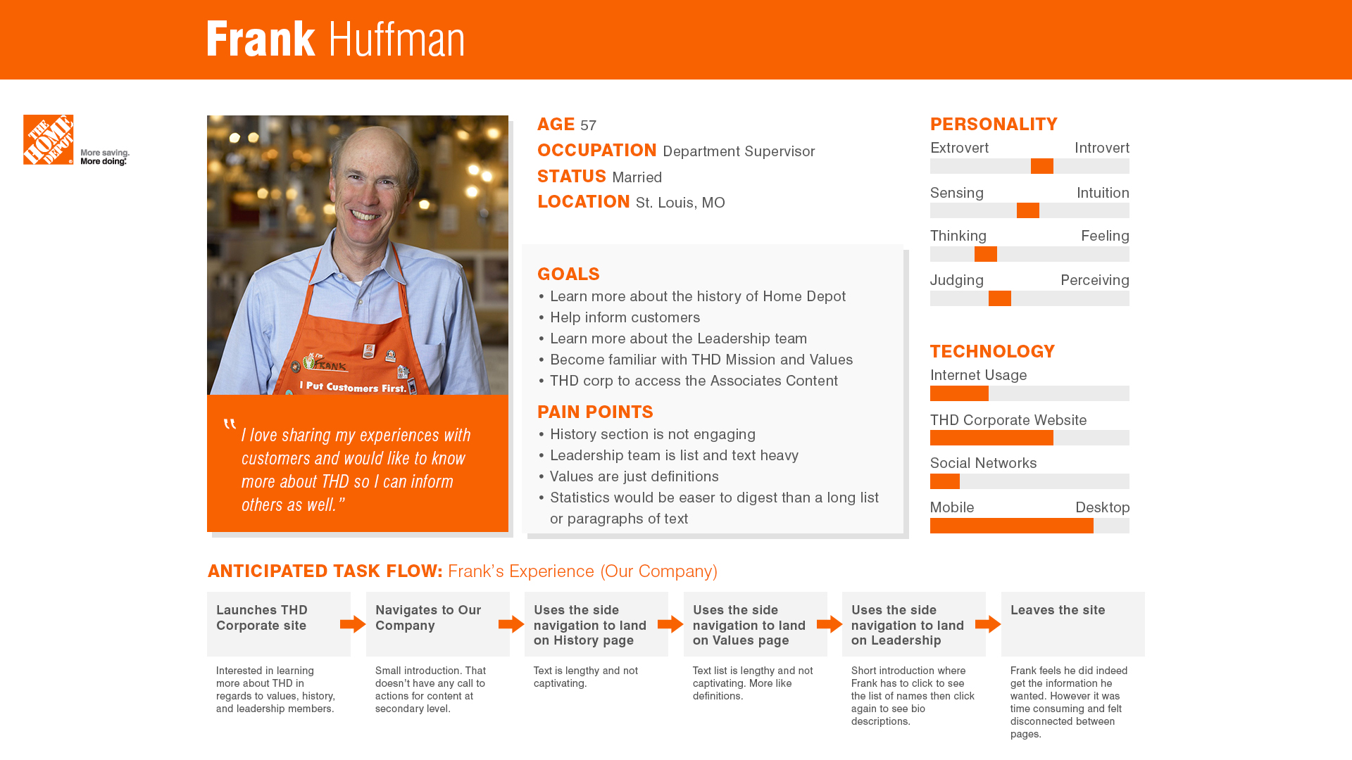
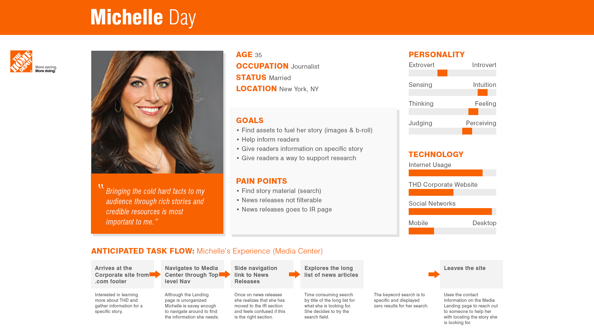
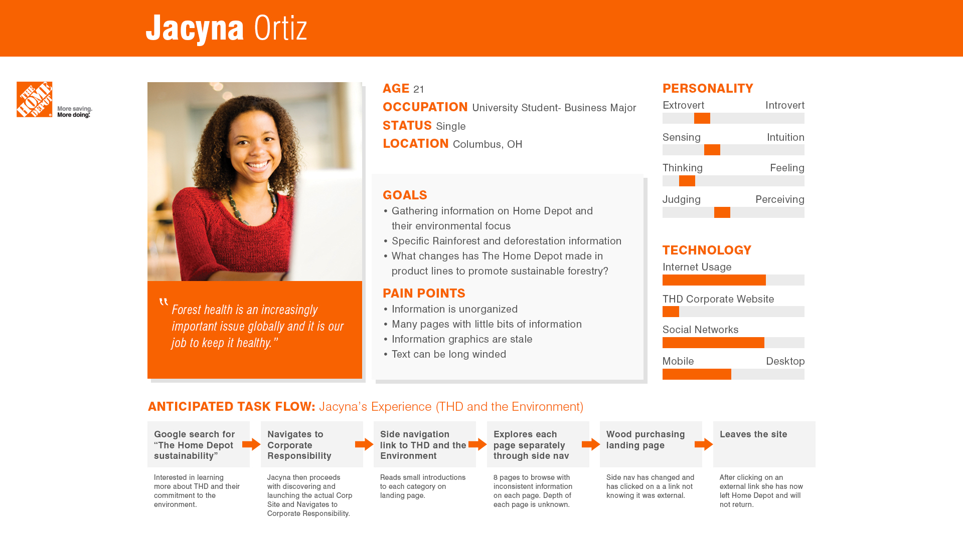
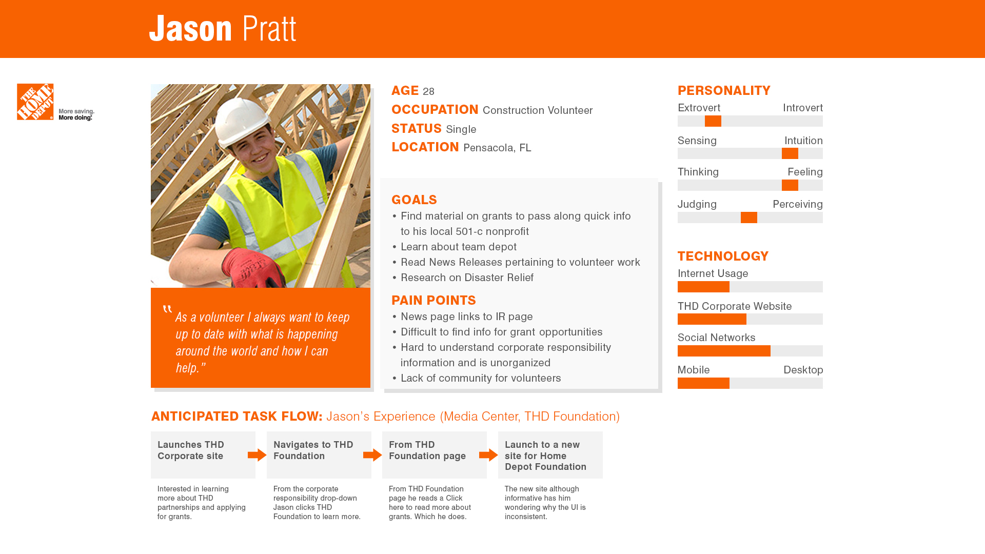
Our insights phase included competitive analysis, stakeholder interviews, and content analysis of three sites to be combined into one fluid experience. I conducted multiple stakeholders interviews to decipher who our target audiences were. I then created personas to represent these audiences. These personas contained our anticipated task flows that would then influence the information architecture of the site.
Knowing who exactly I was designing for allowed me to imagine ideal experiences and focused on how our personas think and behave rather than getting into specifics about interfaces, technologies or business goals.
Keeping the scenarios at a high‐level allowed us to work fluidly and explore concepts that we could easily communicate with our team and client. They formed the backbone of our requirements, and allowed us to express these from both a functional and emotional perspective allowing for further empathy with our users.

UX Strategy
After initial research and workshops with the client I was then able to start creating a draft of the Information Architecture. This was a very important aspect to the project as we had multiple audiences and multiple sites that were to live in harmony on the newly redesigned site.

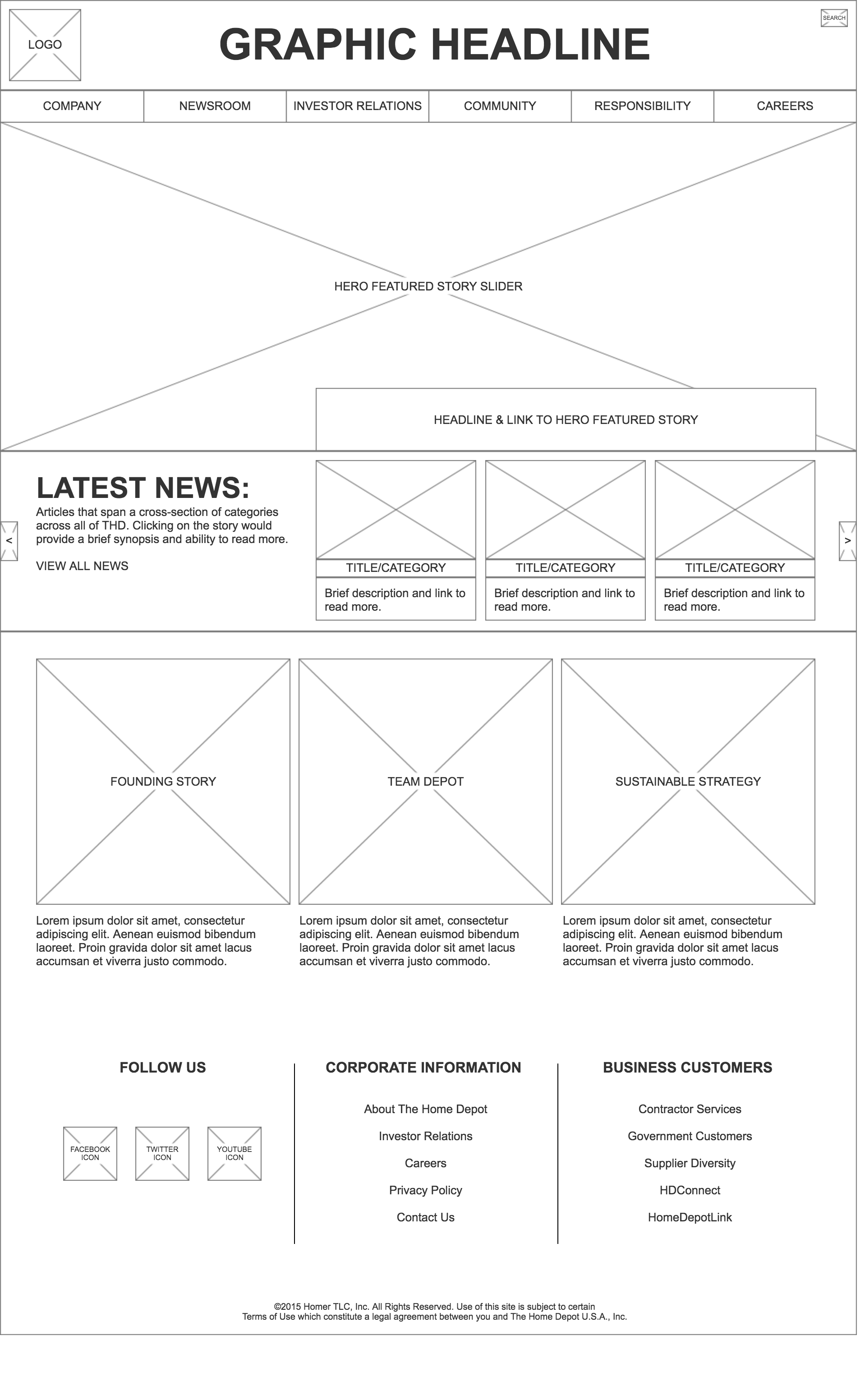
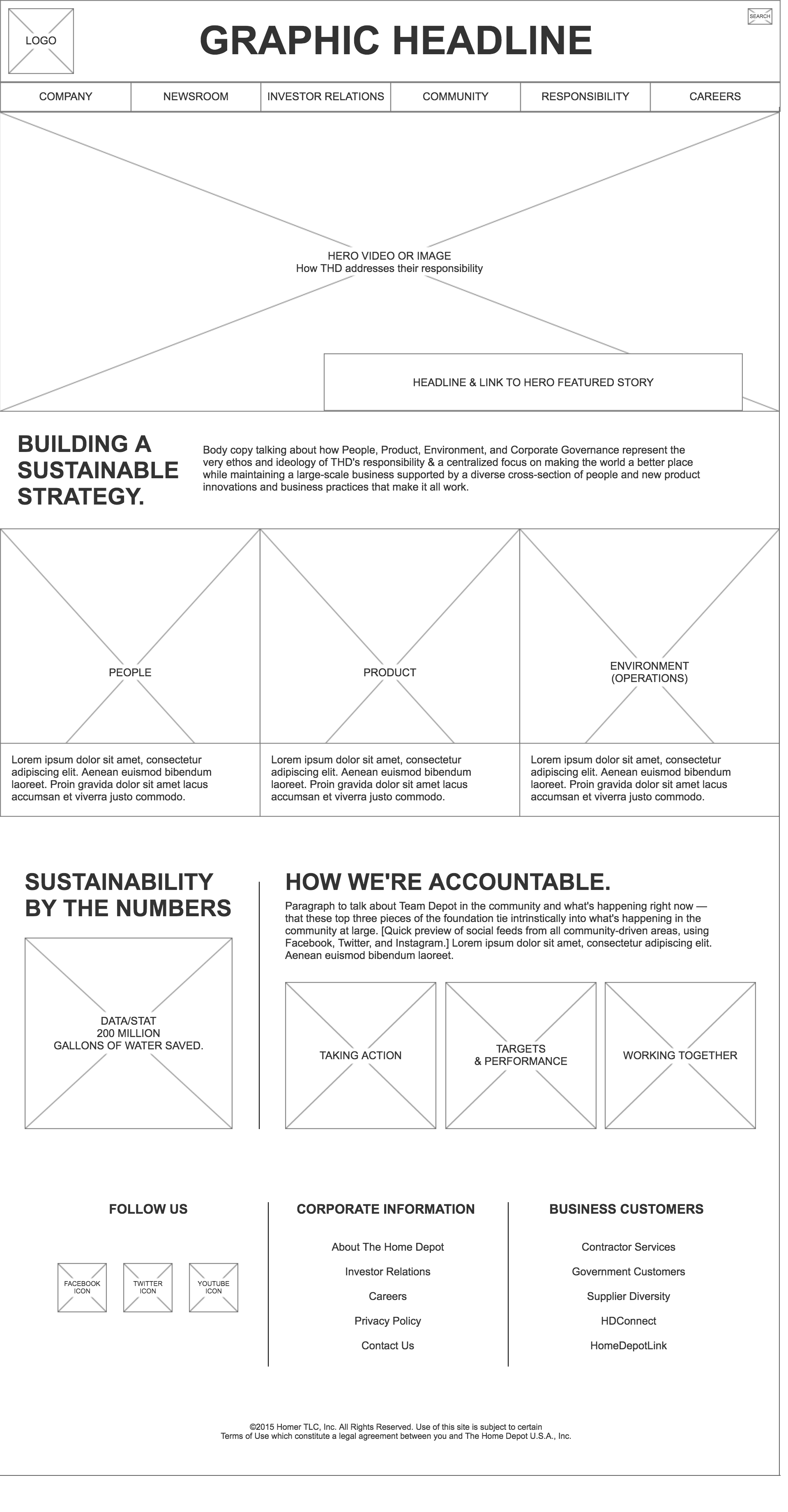
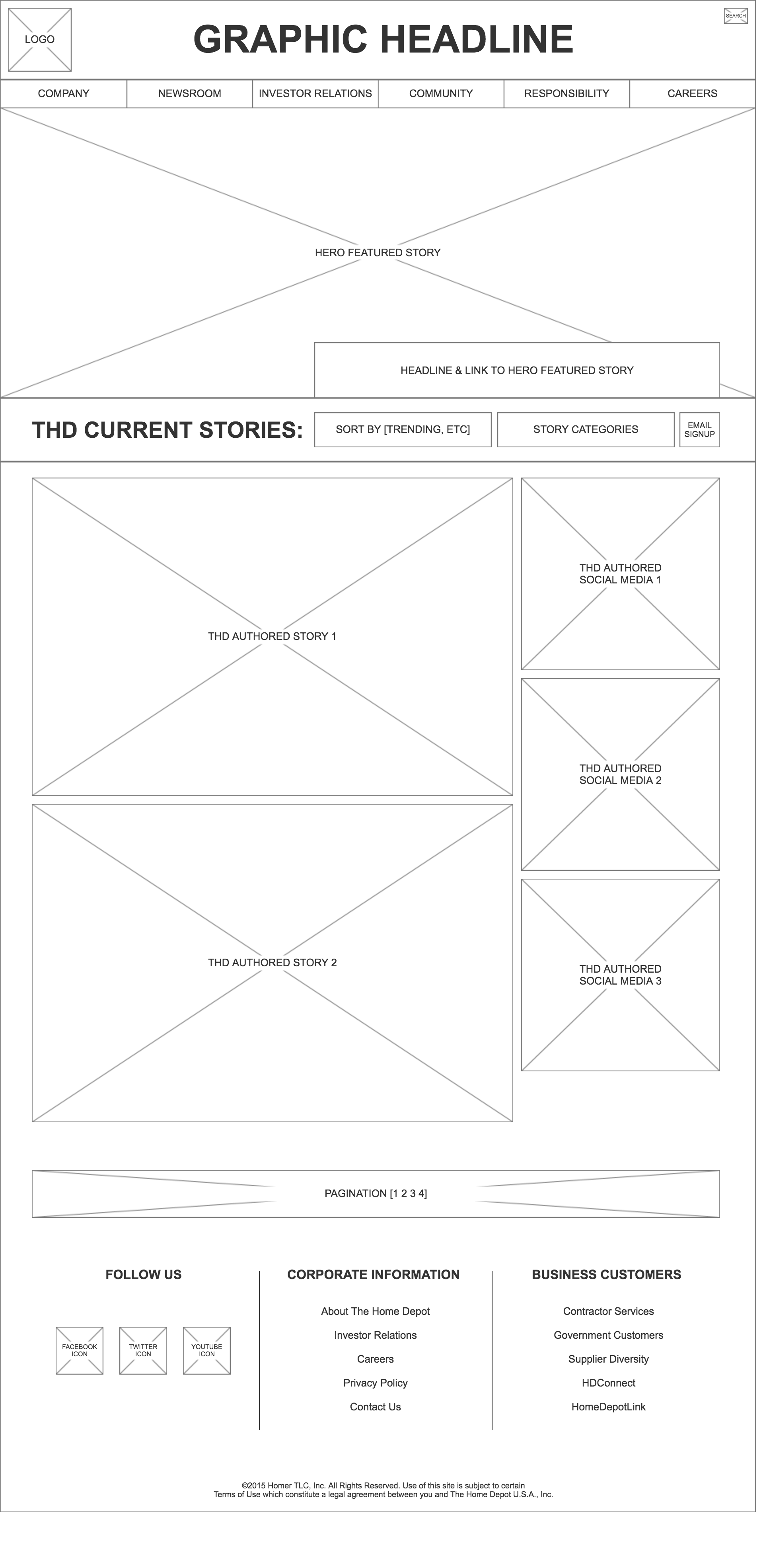
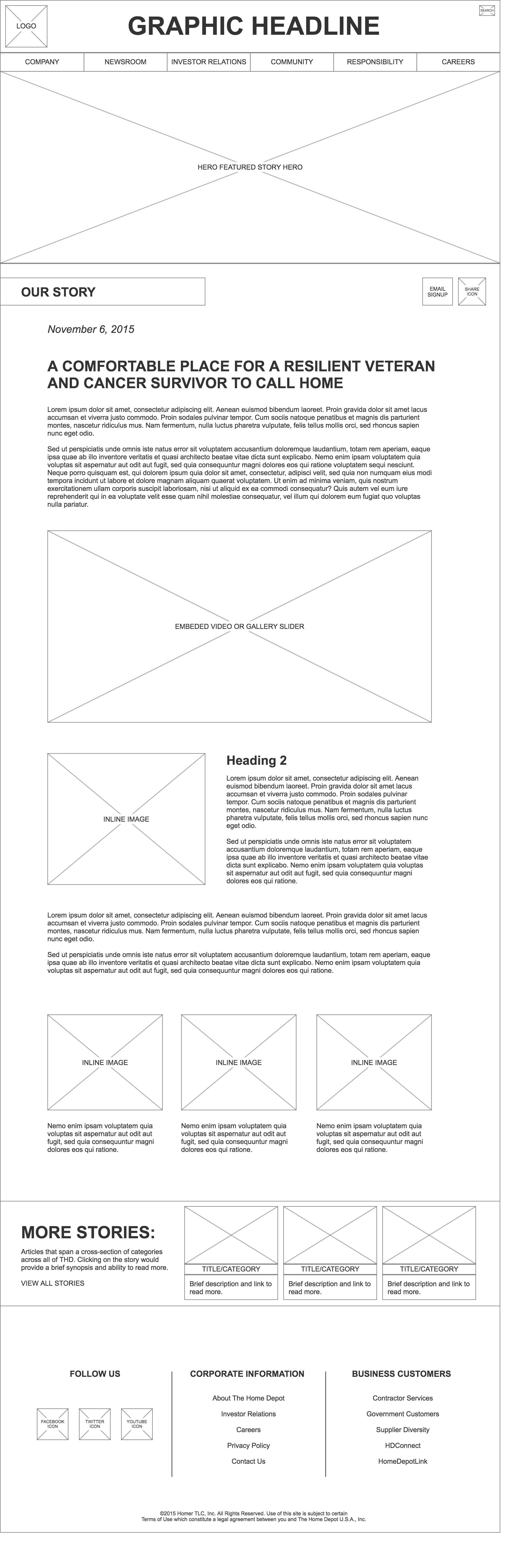
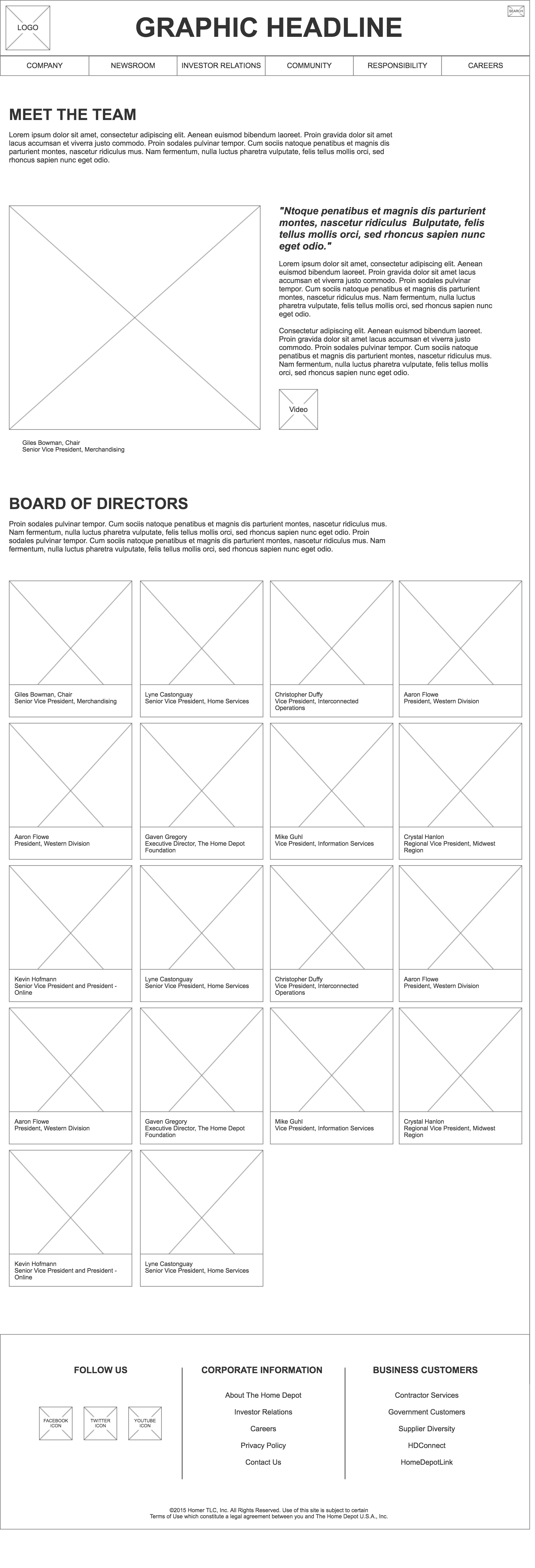
Wireframes
I choose to go with a template structure as this would become a large site and wanted to streamline the design process with our development team. High level wireframes were created to represent the content hierarchy as well as define all new interactions for the site.
I created frameworks and prototypes to share the vision, design principles and content strategy. This helped to reinforce ideas, gain alignment and drive decision making.
visual design
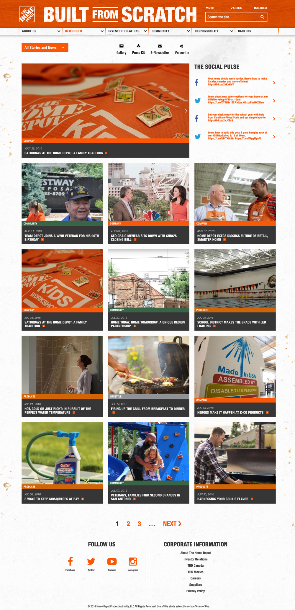
My inspiration came simply from visiting multiple stores to study the true nature of The Home Depot. At these visits I would be taking photos, interview employees, and talk with customers about their experiences with the brand. I realized what was unique about Home Depot was the amount of pride people felt when completing their DIY projects. The grit and sweat would be a theme that is used throughout the site.
After creating three visual directions the final decision from the client was to incorporate pieces from each design to combine and represent The Home Depot. On of my biggest objectives was to incorporate the well know THD Orange brand color without overpowering the visual design of the site. This would bring credibility to the site as well as communicate the new content without overwhelming our users.
I also worked alongside a developer to create an interactive experience surrounding Home Depot and their commitment to improving their stores by repurposing an asset they had already created. Really getting into the spirit of what THD is all about. Try it out here!
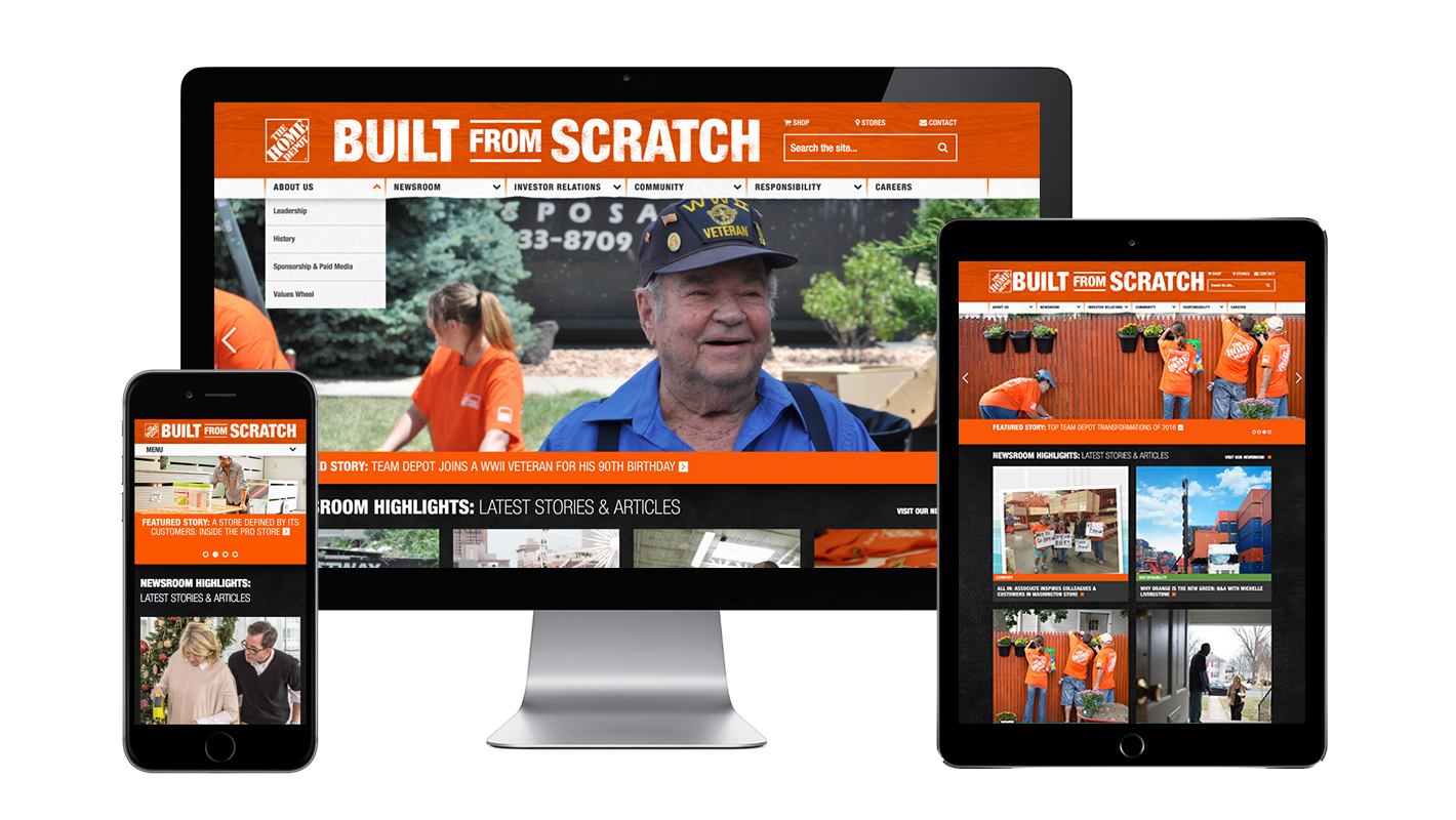
The Solution
The final output was a CMS managed responsive site that allowed The Home Depot team to efficiently manage all content on the site. I redesigned the blog dynamically allowing users to filter areas of interest including; most popular, date, trending, recent, along with a featured articles. We also leveled up facts and figures about THD which was something that was lacking before the redesign.
The new design replaced three separate sites that were managed by three different branches into one wholistic experience that could now be managed by one team.


The Impact
AFTER THE LAUNCH OF THE REDESIGN WE FOUND A 1,118.4% pageview increase yoy.
There was an increase of 265,819 USERS (UNIQUE VISITORS) or a 795% growth.
USERS WERE STAYING IN THE EXPERIENCE an average of 43% longer.
Gained 1,936 new newsletter subscribers.
saw a 32% INCREASE in mobile use from previous year.
Post launch analysis from 6/14/16 - 8/2/16